
 |  |
|---|---|
 |  |
 |  |
 |  |
 |  |
 |  |
 |  |
 |  |
 |  |
 |  |
 |  |
 |  |
 |  |
 |  |
 |  |
 |  |
 |  |
 |  |
 |  |
 |  |
 |  |
 |  |
 |  |
 |  |
 |  |
 |  |
 |  |
 |  |
 |  |
 |
HOLLAND & BARRETT
Holland & Barrett concept store, to be implemented in Cardiff, produced while working in the creative team at Syn.
My Role: Senior Designer
Client: Holland & Barrett
Location: Cardiff
Brief: At first we were tasked with designing a dynamic and thought provoking feature wall that would push the Holland & Barrett brand. After success working with the client in the initial proposal stages, the project quickly grew into a full store design, including a proposed Café area and Yoga space.
Solution: Getting to know the brand was our first step, at the start of the project we visited stores, making sure we knew the H&B shopping experience and their consumers.
The brief outlined that the client wanted an 'outside the box' feature wall that would pull in passer byers from the street as well as bring in a new customer base of Gen Z.
We combined these two approaches of the heritage of trust in H&B, and that of stepping into an exciting future. With this in mind we created 3 routes that had the heart of the brand but executed in a dynamic and eye catching way.
The chosen approach looked to personify what it meant to feel well. Using all the senses to create a feeling that is hard to put into words. This manifested as a abstract, interactive plush textural installation that consumers could sink into feeling both comforted and energised. This wall would act as a photo moment and potential dwell space and would be a colourful way to grab the eye when passing on the high street.
Whilst experimenting with the look and feel of the wall we created a set of symbolic shapes that each encompass a different area of wellness, these come together figuratively and literally to create the overall sense of wellbeing suggesting that H&B understand that health needs a tailored response with consumers looking for different approaches to improving their lives.
Supporting the textural interactive wall we also have a neon sign that asks the question 'How you feeling?' - this starts the conversation with the consumer and asks them to sink into their body and connect with what it is telling them as well as setting the tone of voice for how H&B speaks to its consumers.
Whilst considering the 'Wow wall' and how it would look from the external facade we then were tasked with what a supporting window could look like. We took several approaches to this, designing a modular toolkit that could be redressed with specific campaign propping, an option that looked to visually align with the Wow wall and a wild card option that was bold and had its own distinct look and feel.
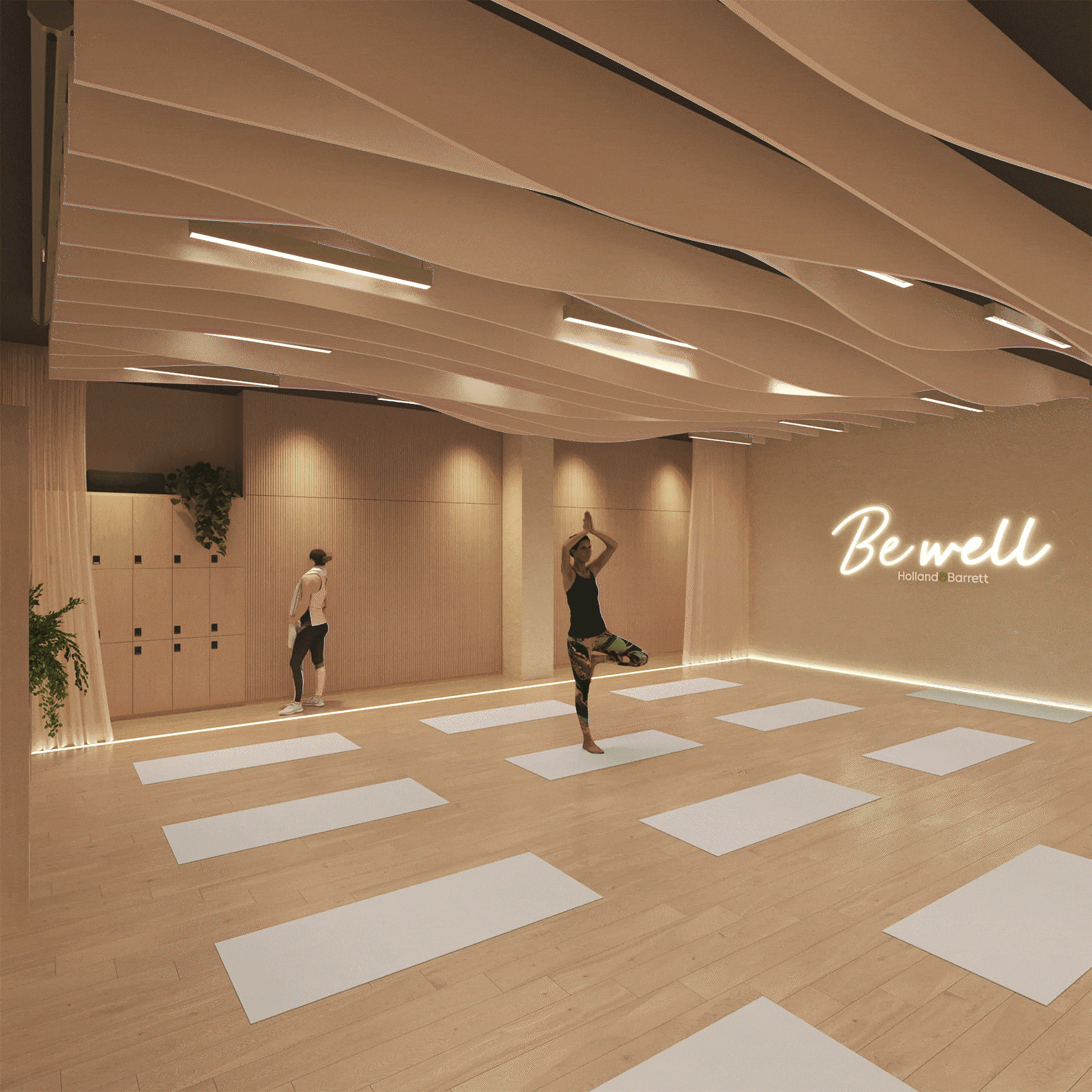
Other areas that we designed included the Cafe which needed to have a functional yet calming feel that felt like a respite from the high street. The Yoga studio was also designed, creating a multifunctional space that felt calming and atmospheric, with the possibility of turning into an immersive yoga experience.